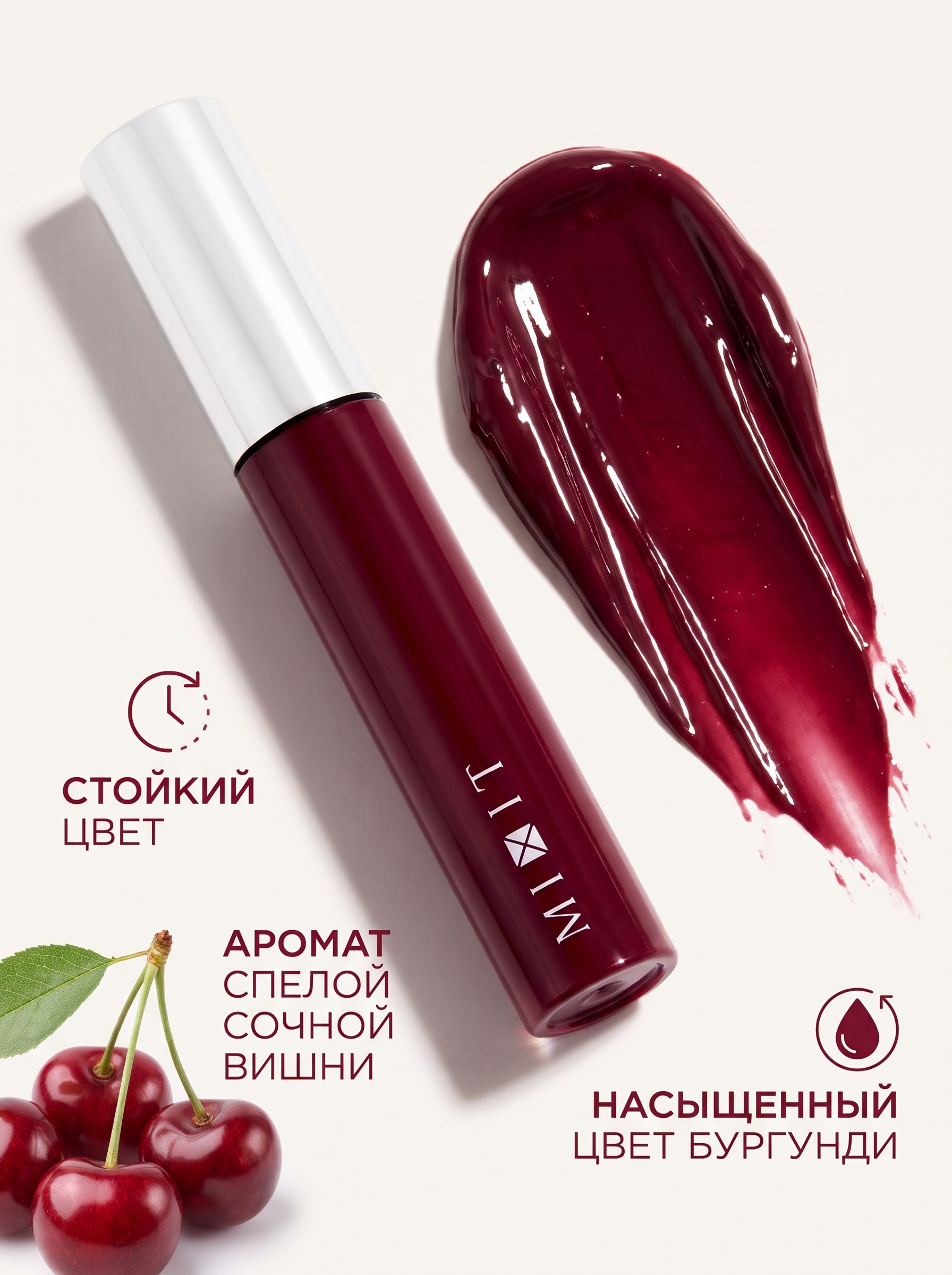
Image - 2026-10-27 12:59
Create a photorealistic high-end beauty product advertisement for a MIXIT burgundy lip gloss, using the provided reference image as the absolute source of truth for the original product packaging. Preserve the lip gloss tube exactly as shown: the same elongated cylindrical shape, precise proportions, rich deep cherry-burgundy red body, glossy lacquered surface, sleek white cap, thin black ring beneath the cap, original white MIXIT logo, typography, positioning, and all structural details. The product must remain instantly recognizable and identical to the reference, without any redesign, color changes, or alterations to its branding. Design a premium marketplace product card with a clean warm-white background, sophisticated beauty-editorial art direction, and a bold burgundy-and-cherry color palette. Position the original MIXIT lip gloss diagonally across the composition as the main hero product, with realistic studio reflections, beautifully controlled highlights on the glossy packaging, and a soft natural cast shadow that gives the tube authentic volume and physical presence. Beside the product, create a large, expressive swatch of the actual lip gloss color, inspired by the reference image. The swatch should look like a generous, freshly applied stroke of richly pigmented burgundy-cherry lip color, with a vivid saturated center, thick three-dimensional texture, smooth creamy coverage, wet glossy highlights, visible ridges of product, softly raised edges, and a naturally tapered brushstroke finish. Make the swatch look substantial, luxurious, intensely colored, and long-wearing, as if a single stroke delivers rich, even pigmentation. Its surface should reflect light realistically, creating dimensional highlights and subtle shadows that reveal the product's creamy, high-pigment texture. The color should be a deep, juicy burgundy with a sophisticated red-wine undertone, visually communicating intense color payoff and lasting wear. Highlight the three key product benefits through elegant, highly legible Russian typography integrated into the marketplace layout: “СТОЙКИЙ ЦВЕТ”, “АРОМАТ СПЕЛОЙ СОЧНОЙ ВИШНИ”, and “НАСЫЩЕННЫЙ ЦВЕТ БУРГУНДИ”. Use a refined contemporary sans-serif font, clear typographic hierarchy, generous spacing, and tasteful burgundy accents. Give each benefit its own concise visual area with subtle graphic details, keeping the text readable on a mobile marketplace listing. Add delicate realistic ripe cherries with deep red glossy skins as a small supporting visual near the fragrance benefit, suggesting the juicy, sweet aroma of freshly ripened cherries without distracting from the product. Use restrained cherry imagery with natural highlights and authentic fruit texture. The overall composition should feel like a professional luxury cosmetics campaign adapted for a high-converting online marketplace listing: clean, striking, premium, tactile, and immediately understandable. Use soft directional studio lighting from the upper left, gentle fill light, realistic reflections, accurate contact shadows, natural material rendering, and crisp product focus. Maintain generous negative space and a balanced composition, with the lip gloss and oversized burgundy swatch as the two dominant visual elements. Render the image in a vertical 3:4 aspect ratio, suitable for a cosmetics product card. Ensure the original MIXIT packaging, logo, cap, colors, and proportions remain faithful to the supplied reference, while all three Russian benefit statements are spelled correctly and remain clear and readable. The final result should look like a real commercial product photograph art-directed by a professional beauty advertising team, with no artificial-looking textures or unnecessary decorative elements.
Free to start · Generate videos and images with AI in seconds
More from this creator


More Fast gen images
См. все →