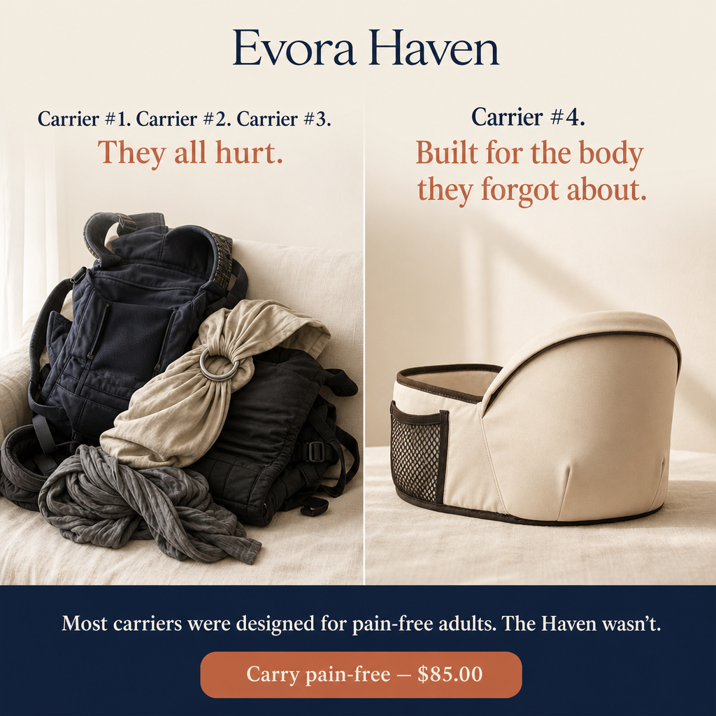
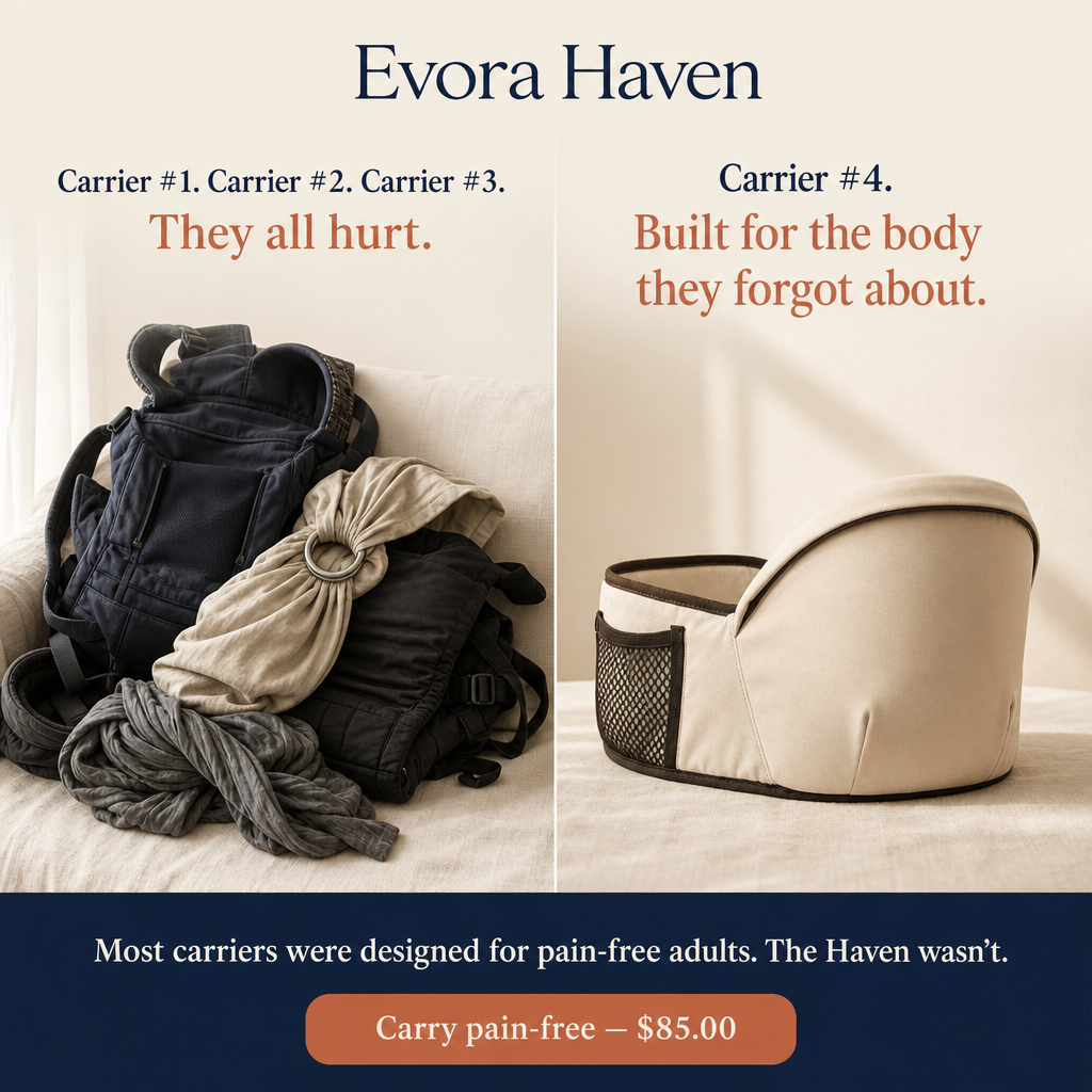
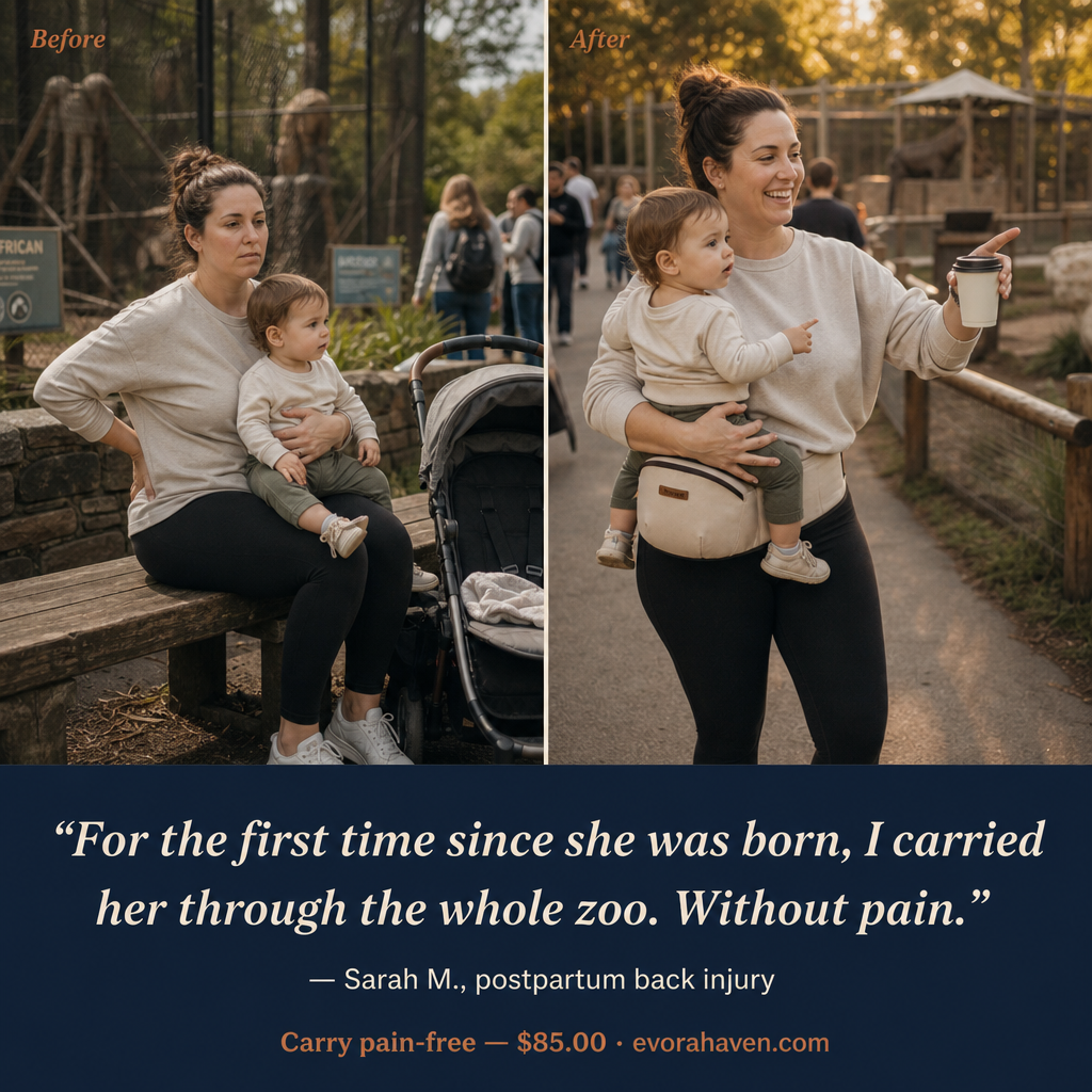
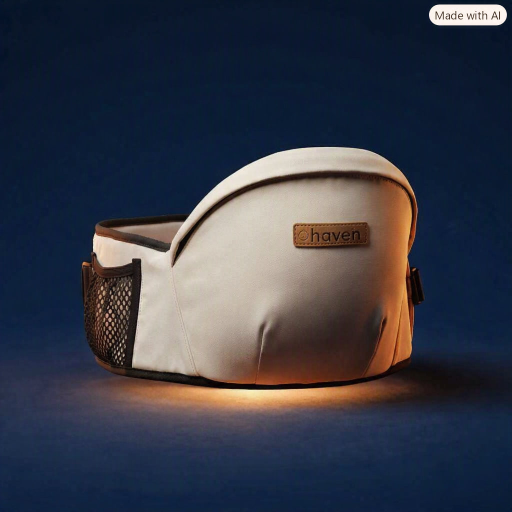
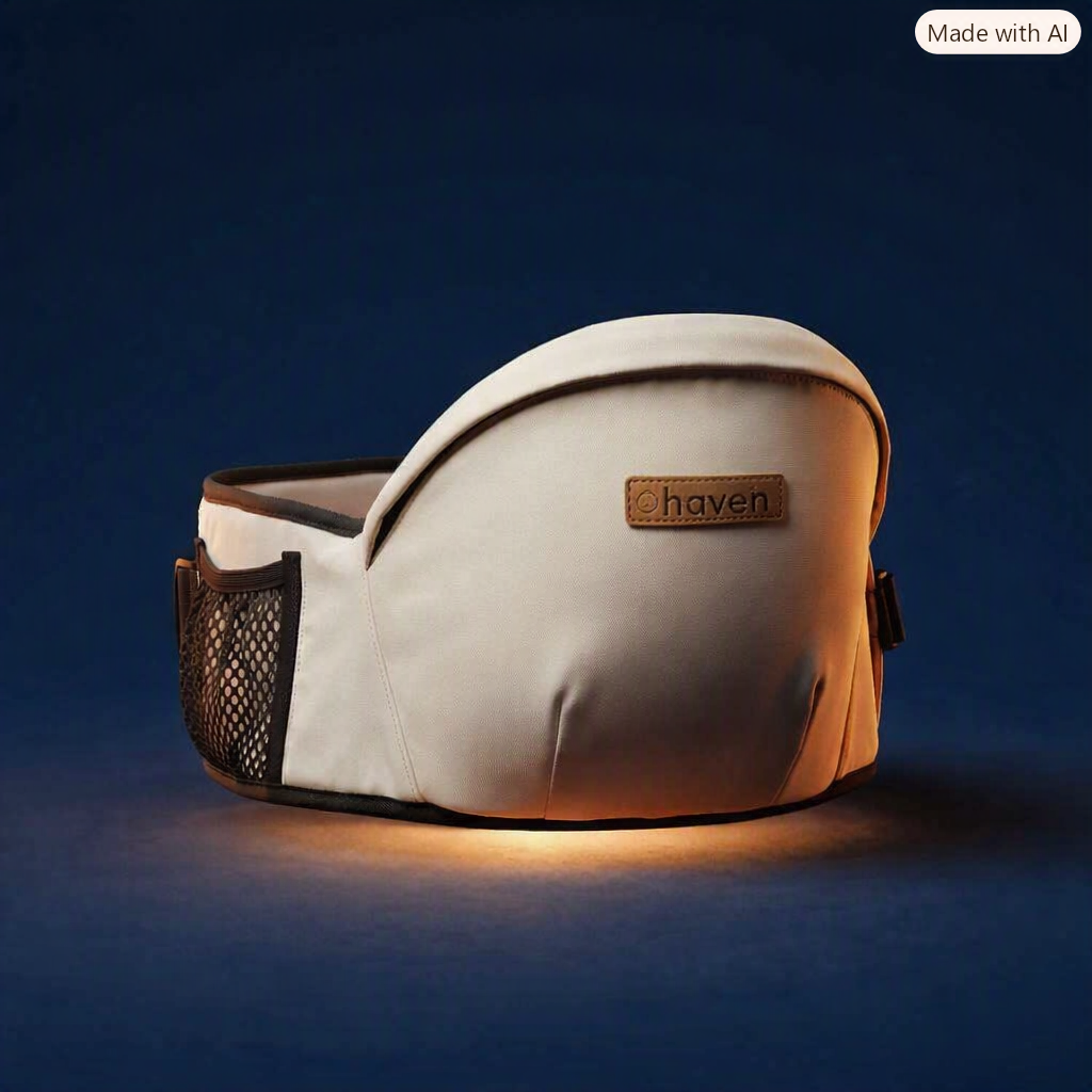
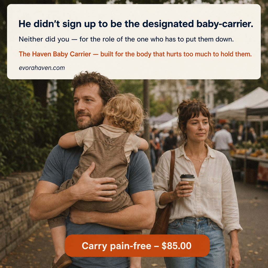







Clean split-panel product comparison photograph. Studio-adjacent but warm, not clinical. Cream #F3EFE4 background throughout. LEFT PANEL (60% of frame width, slightly cooler tone): A pile of 3–4 different baby carriers — a structured SSC with shoulder straps and back buckle, a ring sling, a wrap — piled messily on a cream linen surface or chair. They look used. Maybe slightly crumpled. The pile communicates "tried and abandoned." No brand logos visible on any carrier. Soft natural window light from left. Above the pile, text overlay in navy: "Carrier #1. Carrier #2. Carrier #3." Below in terracotta: "They all hurt." RIGHT PANEL (40% of frame width, slightly warmer, cream tone): A single product — The Haven Hip Carrier: beige/warm-tan hip platform, NO shoulder straps, clean and simple — placed flat on cream linen surface, slightly angled, well-lit, uncluttered. It looks purposeful and simple where the left pile looks chaotic. Above the product, text overlay in navy: "Carrier #4." Below in terracotta: "Built for the body they forgot about." BOTTOM BAR (navy #122038 background, full width): Cream text: "Most carriers were designed for pain-free adults. The Haven wasn't." Terracotta CTA pill: "Carry pain-free — $85.00" Top centre: "Evora Haven" wordmark in navy on cream. PRODUCT ACCURACY: The Haven must have beige/tan hip platform, NO shoulder straps, NO back straps. Clean and simple is the entire visual argument. NEGATIVE: No OEM branding on any carrier. No harsh studio lighting. No white-background product shot style — keep it warm and human.
Free to start · Generate videos and images with AI in seconds