Image - 2026-07-22 10:55
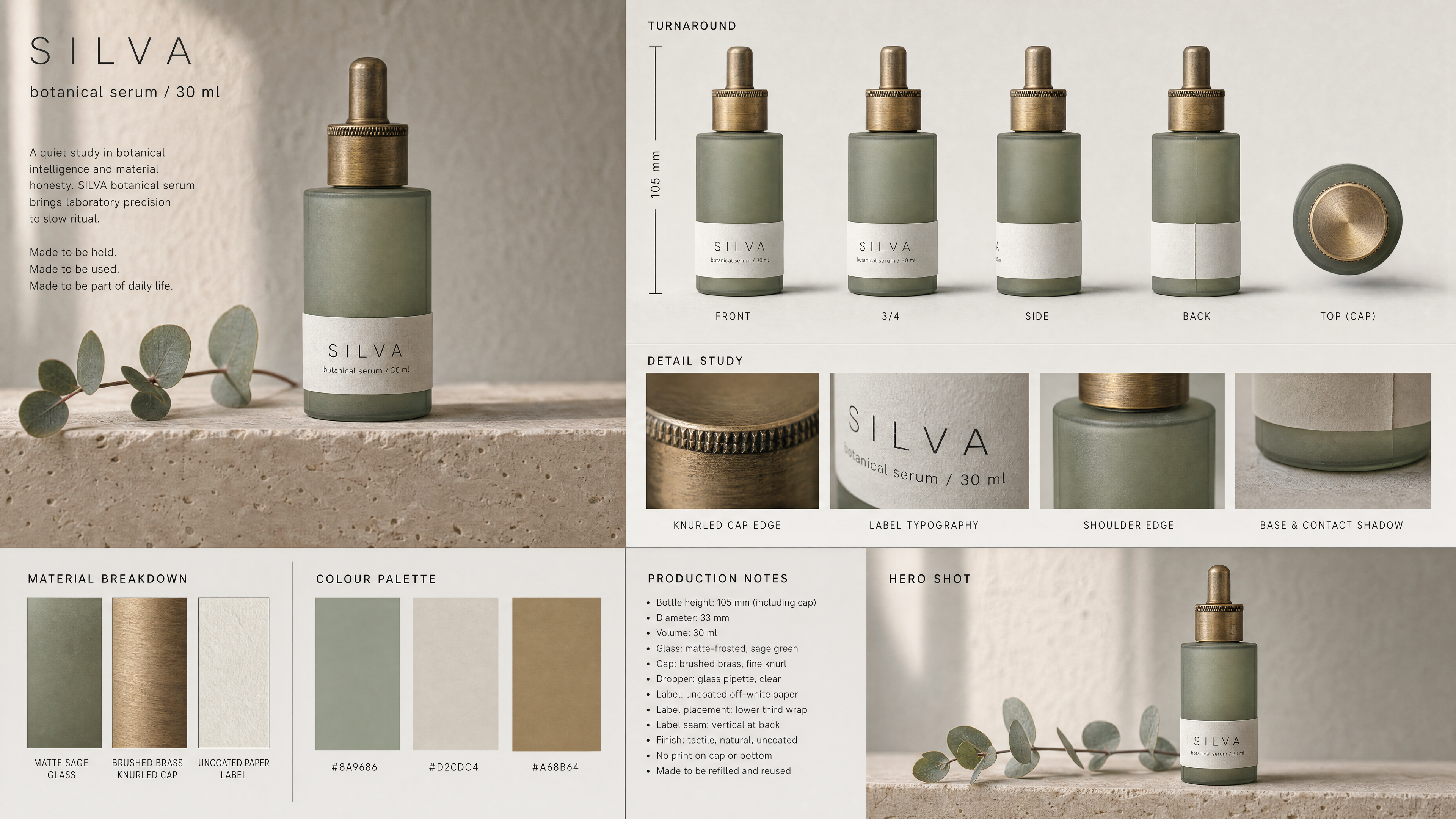
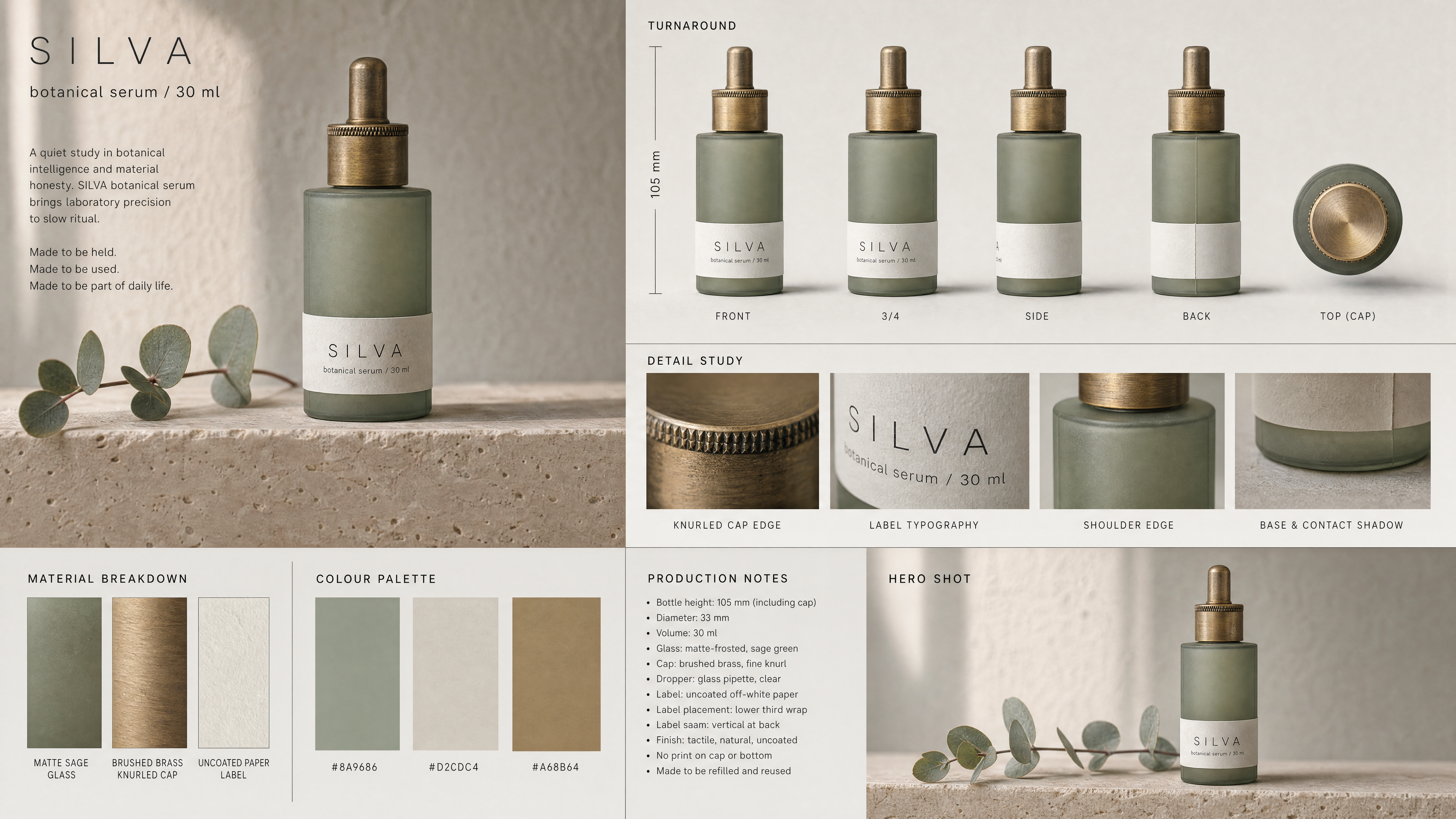
Create a cinematic, production-grade product design sheet for a brand team, packaging department and campaign art director. Product name: SILVA BOTANICAL SERUM. Must feel like a premium beauty brand pitch board, not a generic packshot grid. CORE DIRECTIVE (NON-NEGOTIABLE): No generic layouts. No evenly spaced grids. No symmetry for symmetry's sake. Composition must feel art-directed, intentional, slightly asymmetrical. Every section must feel placed, not auto-generated. PRODUCT IDENTITY: Name: SILVA | Line: botanical serum | Volume: 30 ml | Height: 105 mm including cap | Format: straight cylindrical apothecary bottle with squared shoulders | Design language: quiet Nordic pharmacy, restrained and tactile, nothing decorative FORM DESIGN: Structure: straight cylinder, squared shoulders meeting the body at a crisp edge, flat base, no taper, no curvature — fully realistic industrial proportions | Glass: matte sage-green, evenly frosted, soft light diffusion through the wall, faintly darker where the liquid sits | Cap: brushed brass dropper cap, fine knurled edge, warm unpolished tone, slightly darker in the knurl grooves | Distinct features: a barely visible mould seam running down both sides, a hairline of clear glass at the very base, the brass showing faint tarnish at the edge of the knurl BRAND POSITIONING: Core traits: understated, clinical warmth, slow skincare, honesty over promise | Tension: a laboratory object that belongs on a wooden shelf, not a bathroom cabinet | Category signals: apothecary heritage without costume, pharmacy precision without coldness | Emotional baseline: calm, quiet, unhurried PRESENTATION DIRECTION: The product must feel photographed, not rendered. No floating, no perfect levitation, no CGI sterility. Every view sits on a real surface with a real contact shadow. Avoid staged perfection. Capture the object as a physical thing with weight. Placement logic: upright and braced, base fully in contact with the surface, never tilted for effect. LABEL AND MARKING: Label: single off-white uncoated paper label wrapping the lower third, wrapped with a visible vertical seam at the back, edges slightly lifted where the paper meets the glass | Typography: "SILVA" in thin uppercase sans-serif, generously letter-spaced, and directly below it "botanical serum / 30 ml" in smaller grey type | The text must be sharp, correctly spelled and legible in every view where the label faces the camera | No other text, no logo, no icon, no barcode, no seal, no marking anywhere on the bottle or the cap MATERIAL ACCURACY: Frosted glass must show real light interaction — soft internal scatter, a diffuse highlight rather than a hard specular line. Brass must read as brushed metal with directional grain, not chrome, not gold plastic. Paper must look uncoated and slightly absorbent, with fibre texture at the cut edge. Include imperfections: a faint fingerprint on the matte surface, one grain of dust, the slightest wear at the cap edge — the object looks handled once, not worn out, and never brand new from a render. TURNAROUND (STRICT): Front elevation, 3/4, side, back, top-down onto the cap. Identical proportions and design fidelity. No drift in form, colour, label position or cap dimensions across any angle. The label seam appears only in the back and side views. The knurl pattern is identical in every view where it is visible. DETAIL STUDY: Macro of the brushed knurled cap edge | Macro of the label typography at wrapping curvature | Macro of the shoulder edge where matte glass meets the cap | Base and contact shadow | Cap removed, showing the glass dropper pipette and its brass collar | Backlit study showing the serum colour through the frosted wall HERO SHOT: Environment: standing on a pale travertine ledge, a single eucalyptus sprig lying beside it slightly out of frame, plain plaster wall behind | Lighting: soft north daylight from a window at camera left, long gentle falloff, one narrow warm reflection along the brass | Colour tone: sage green and warm stone against cool plaster grey | Mood: early morning, unstyled, the object simply there | Camera: 100mm macro, shallow depth of field, cinematic realism LAYOUT: Clean, art-directed sheet. Neutral warm grey background. Include: height scale in millimetres, annotation callouts, material breakdown, colour swatches, production notes. Must feel like a premium studio board. STYLE: photorealistic commercial product photography, editorial beauty campaign development. Must include: natural imperfection, soft filmic contrast, muted palette of sage green, warm stone and faded brass, high material readability. No stylization, no 3D render look, no glossy plastic surfaces, no artificial glow. CONSISTENCY RULE (STRICT): Form, proportions, colour, label placement and cap detail must remain IDENTICAL across all views. No reinterpretation between angles. Ever. OUTPUT: Extremely high detail. Sharp focus. Production-ready fidelity. Suitable for packaging development, campaign pre-production and brand decks.
Free to start · Generate videos and images with AI in seconds
More by SHPENDE
См. все →


More GPT Image 2 images
См. все →